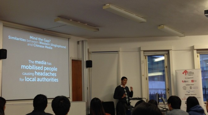
What I do as part of teaching at the Communication University of China is to — well, of course, teach kids, but also to get them to look good onstage. It is said that public speaking is the one thing that is feared the most, especially in the United States, and you’d think for that nation of inspired speakers, such statistics would be hard to imagine.
Some of the kids end up great onstage; others merely murmur even with their mouth an inch away from the microphone. Here are the ten #FAILs I’ve seen — for best results, don’t be like them.
- Outright fear onstage. This can easily blind you, even kill you, onstage with fear. The audience will probably be sympathetic for a few seconds at the start, but then that’ll quick change over to a feeling of Don’t we have someone more qualified?, and you’ll feel they’ll want someone else onstage.
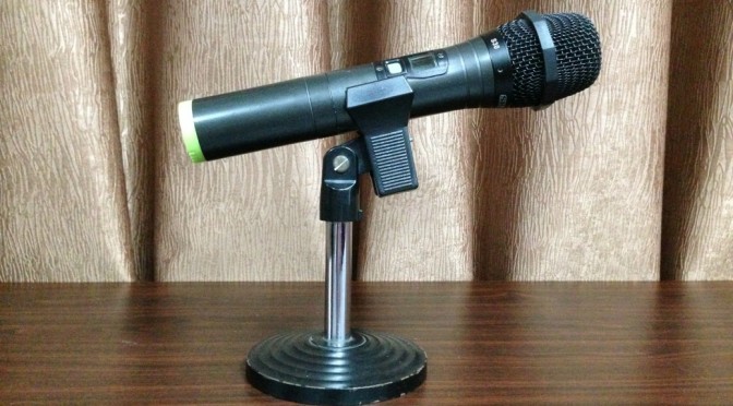
- Keeping your mouth too close to the microphone. With or without a cover of any kind, this is the worst sin onstage: You risk frying everyone’s ears. You also risk exploding your consonants. People are there to be entertained, not to have their ears perforated! If anything, keep probably an inch or inch-and-a-half from the microphone to your mouth. If this isn’t working great, ask the technician beforehand so that they get the amp maths done right. Note that if you use a handheld mic, never aim it at a speaker, nor even use it close to one — there’ll be very audible feedback and you risk getting the audience shouting as you as the noise level becomes too loud!
» Also: Keep your hands off the microphone (except if you use a handheld one). Also: if you use clip-ons, don’t play with the device and switch on only when it’s properly “worn”. I’ve seen students a little less than super-confident, trying to cling onto the mic stick (this was for a “flower mic” like you have at most conference rooms). To me, it’s like showing us you’re all about attention: instead of being able to present naturally, you are trying to suck all our attention and are never going to let go of it. TED Talks, as examples, do much the same, yet nobody there grabs your attention with moves like these. Content is what will win audiences at the end of the day.
- White-on-black slides. The opposite, interestingly enough, works great: white-on-black (or for best results, off-white on off-black) works even if you have the lights on. I use that for all slides everywhere.
- Clip art. It just makes you look unprofessional. Maybe if you use it for effect, you might “sin” less, but I’d still avoid it altogether in my presentations.
- Magic Move if used carelessly. Everything which moves or makes a noise is prone to being abused as some novice wants to show he or she has exhausted all the bells and whistles of Keynote or PowerPoint. Don’t — even if you are showing it to a bunch of 4-year-olds (if you really are, though, I might forgive you). The worst use of Magic Move is moving stuff all over the slide aimlessly.
- Audio unless it makes sense. Using cheesy “pzshwoow!”-ish clips is sure to land you close to the Fatal F in my classes. But if you use it to show a clip of Lady Gaga, or something that’s relevant to your talk, that’s when I really tune in.
- Animated GIFs. In a recent teaching contest, I marked candidates down heavily for this — these highly annoying GIFs were all over the place. They rolled in, flew to the centre of the screen — everything. The local circus shows turned out more polished, in comparison!
- Tiny text. Guy Kawasaki says never to use any font smaller than 30 points, and I’d blow it up to 36 points or ideally 40 points. I always make a point of heading to the back of the class — to both hear how they used the mic and how they used font sizes onscreen. Never mind I’ve eagle eyes: if even i couldn’t see it, you’re in trouble.
- No eye contact or burying yourself with notes. (The other sin is “no interaction.”) These are amongst the best ways to lose points with me. You’re presenting for live people — so make an attempt and talk with ’em!
- Badly done transitions. Here, I mean both the transitions themselves — and how presenters transition from one to the other. If I even so much as hear And now let’s go on to the next slide more than three times (provided you’ve control of your Mac or PC with the presentation — this is why I stress you either have to use your own gear or, even better, get a clicker), I’m marking you down. We are all humans. We don’t need to be talked to as robots.
Thankfully, I’ve seen a few students that outright shone. The recent teaching contest ended up with the winner giving a talk that could easily win her TEDx access. (She also ended up being promoted straight to the national finals, in addition to winning the Beijing round of the contest.) There’s still hope out there. I’m hoping we’ll see more and more star speakers. Here’s hoping we do!


